


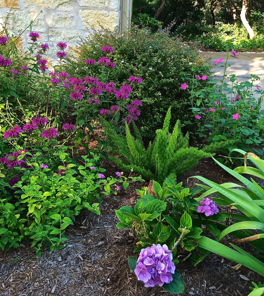
Color is the most conspicuous element in the landscape. It’s what others notice when they visit and it’s how we plan on our forays to local nurseries. It sets the mood that permeates the landscape and often defines its purpose.
Everyone has a favorite color and certainly your garden should be a reflection of your taste and style. But putting together a pleasing and successful color palette challenges many a gardener. And, in spite of careful planning, sometimes volunteer plants pop up in places they weren’t planted or a perennial’s bloom isn’t what quite as it was advertised.
When the wrong colors meet up in the landscape, it’s sometimes enough to make you shield your eyes.
With a little careful planning, pruning and a color wheel, you can use color in your landscape to provide unity and set the mood in your outdoor haven.
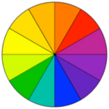 Sir Isaac Newton developed the first circular diagram of colors – the color wheel – in 1666. His work on color theory provided a logical structure for the relationship between colors.
A successful grouping of colors creates harmony – a pleasing arrangement of landscaping plants. It also affects how we view spatial relationships among colors.
Yellows, oranges and reds are defined as “warm” colors, whereas blues, purples and greens are considered “cool” colors. Warm colors pop out at you in the garden and sometimes feel closer than they are. The cooler colors tend to recede and seem farther away in the landscape. For example, cool colors in a border around a small back yard can draw they eye back and make the space seem larger than it actually it.
Warm colors evoke an active, vibrant mood in the garden. Hues of blues have a more calming, peaceful effect. Interior designers often choose shades of blue for decorating bedrooms for the same reason. The palette in a garden can reveal volumes about the nature and style of its gardener.
There are many possible combinations of colors that make successful pairings or groupings when using the color wheel.
Complementary colors: These simple combos create a vibrant look in the garden. Complementary colors are those directly across from one another on the color wheel. These combos are easy to work with when you’re planning your landscape if you remember that opposites attract.
Secondary colors: These groupings are created by forming an equidistant triangle on the color wheel. However, not all three colors can be dominant. One color should provide the focal point, allowing the other two to sing backup in the landscape.
Analogous colors: These 3 colors appear directly next to each other on the wheel and are considered different hues in the same color families. These pairings complement a monochromatic-style design.
Many more color theory combinations exist, these three are the most commonly used.
The most transient of the elements in the landscape, color wanes and evolves throughout the seasons. Brilliant foliage in spring and bright blooms in summer often recede in fall and winter to more muted tones. For an all-season garden, look at your beds with a critical eye in the off seasons as well. Consider the changing color palette and how you can add a few carefully selected plants to make your garden pop year-round.
Planning with these design simple guidelines will bring added depth and dimension to your landscape. It will allow your plants to stand out, showcased against neighboring plants of complementary colors and hues.
Local Landscape Designer and Garden Coach Diana Kirby provides landscaping tips at http:/www.dianasdesignsaustin.com and writes a garden blog at https://www.dianasdesignsaustin.com